Logo Story
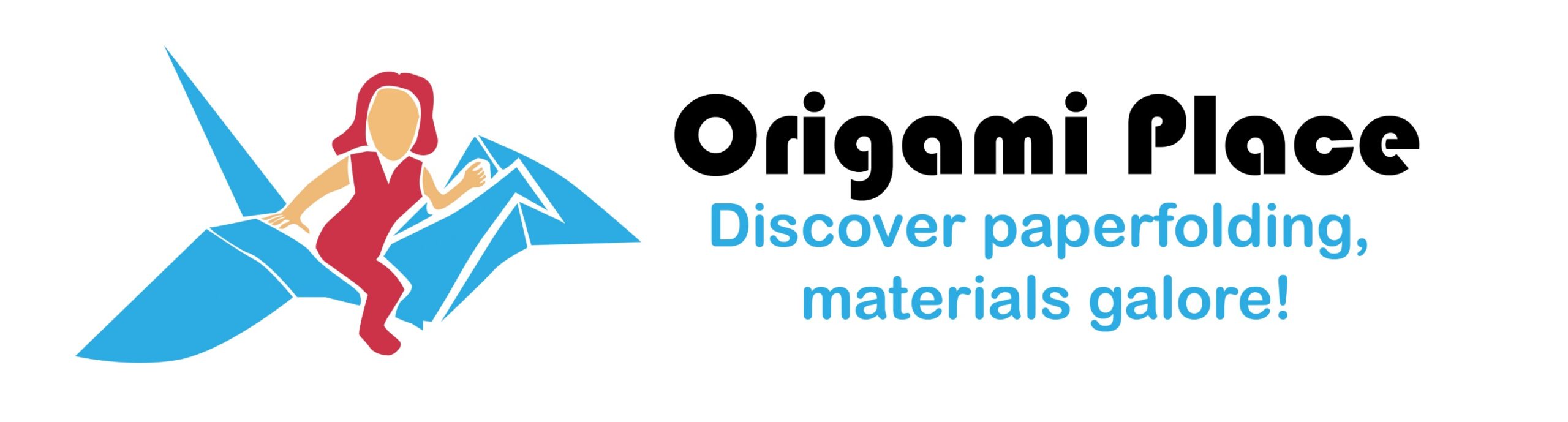
 Beginning as Rocky Arts, then Rocky Arts Unfolded, we are Origami Place.
Rocks are beautiful and stable – that is what we aim to be! We want to have strong rocks in a good place. In the end of 2019, Rocky Arts transformed (or unfolded) into Origami Place, both business’ logos of my design with a little inspiration from others.
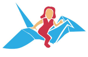
In 2014, a friend named Mei-Lin painted an artwork for me, with the highlight of myself on flying upon a crane. In 2019, I looked at that artwork and realized the highlight could be a good logo. For a couple months, it sat. I received input from friends including the thumbs-up from Mei-Lin. I scanned the
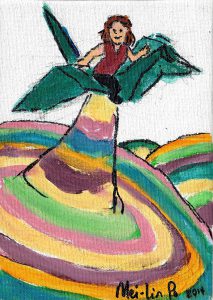
artwork, then I traced it in Adobe Illustrator and tweaked it a bit after critiques. This Origami Place logo is a young lady flying upon a blue crane. The peace crane is a symbol of strength to blossom and inspire. At Origami Place people take flight from beauty on a journey full of hope and adventure.
Previously![]() , the Rocky Arts logo began with a mixed-media block of wood built into an artwork in 2008. The idea was to illustrate stability upon rocky terrains. Tested on cardboard pieces, I sprayed them with adhesive, attaching the three colors of tiny rocks, aka sand, in the three colors of maroon, turquoise and dust. The final version on the wooden block was scanned to become the diamond shape center within the logo. The wooden block is a historical artwork with slight additions. For that first logo, I added a computer-generated pattern around it to complete the design and to make the logo what it was from 2008-2019. The business idea is that we start feeling a little rocky; first we struggle, then blossom, and
, the Rocky Arts logo began with a mixed-media block of wood built into an artwork in 2008. The idea was to illustrate stability upon rocky terrains. Tested on cardboard pieces, I sprayed them with adhesive, attaching the three colors of tiny rocks, aka sand, in the three colors of maroon, turquoise and dust. The final version on the wooden block was scanned to become the diamond shape center within the logo. The wooden block is a historical artwork with slight additions. For that first logo, I added a computer-generated pattern around it to complete the design and to make the logo what it was from 2008-2019. The business idea is that we start feeling a little rocky; first we struggle, then blossom, and ![]() finally amaze. Personally, I started folding origami, ran into a tough spot, pursued origami as a stable rock and finally found my place! Now, at the Origami Place we invite you to discover paperfolding, materials galore!
finally amaze. Personally, I started folding origami, ran into a tough spot, pursued origami as a stable rock and finally found my place! Now, at the Origami Place we invite you to discover paperfolding, materials galore!